‘The Geomancer’s Apprentice’ Is Getting a Brand-New Look
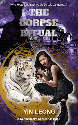
I was happy with the original cover for The Geomancer’s Apprentice, but I decided to refresh it for the novel’s release on new platforms.
The book, now available on Amazon, will also be offered on Kobo, Google Books, Apple Books and Barnes & Noble as of May 7. It will come with a new cover.
The cover sets the reader’s expectations. It clues the reader in as to the genre. It sets the mood for the book.
Just for fun, I decided to show some of the mock-ups my husband and I went through (and discarded) in the very early stages of designing the original cover.
 |
Graphic-Based Cover:
We took a character
design done for me by a graphic artist (Leticia Kifo at Fiverr.com), and ran it through a GIMP filter.
I thought the black background was edgy, and the bright lines hint at qi, the life force underpinning the universe and the source of Junie’s power.
Ultimately, however, I thought the graphic-based cover might lead readers to mistakenly believe the book is for middle graders, rather than people of all ages.
Chinatown:
This cover depicts one of my favorite parts of Chinatown in Washington, D.C., which is where Junie and my other main character Joe Tham live and work. It showcases a photograph I took of the Friendship Archway, the traditional Chinese gate that welcomes visitors to Chinatown. We ran the photo through a GIMP filter that makes it look like an oil painting.
While I liked the look, I found the cover more suitable for literary classics like The Great Gatsby or The Good Earth than for urban fantasy.
Luopan:
This cover features the luopan, or Chinese geomantic compass. Feng shui practitioners, otherwise known as Chinese geomancers, use the device to find direction. The luopan shows 24 directions and various formulas that allow geomancers to determine a building’s orientation and the precise energy associated with that orientation.
Joe’s luopan isn’t an ordinary Chinese compass of course. He and Junie use it to detect unnatural or supernatural energies in their clients’ homes and businesses.
I thought the luopan added strong lines and bright color, especially against the thick black bands. However, my concern was the cover gave the book more of a how-to feel than an urban fantasy.
Readers might think it was a geomancy manual.


Comments
Post a Comment